The Problem: many separate voices, one identity to reclaim
Before this project, the company communicated in a fragmented way. Separate mini-intranets had been built for individual group entities, each with its own editorial approach, while the company’s ambition had shifted dramatically: instead of distinct entities speaking separately to their own employees, the goal was a single group communicating with one voice.
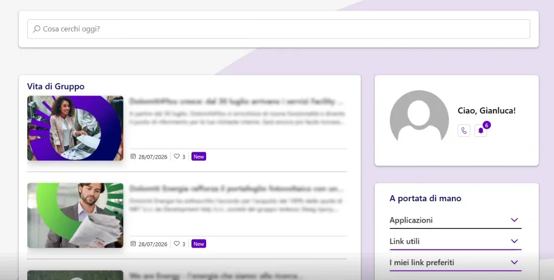
The legacy colour palette, heavy on blues, no longer reflected the identity the company wanted to project, and a deep change was needed, one that went beyond aesthetics.
There was also a more delicate challenge tied to the people themselves. The company experiences a fairly high turnover, with several retirements each year, sometimes five in the same month. Publishing an individual welcome news item for every new joiner would have flooded the intranet with repetitive announcements, making it impossible to give any real prominence to those arriving.
Company intranet homepage
Our Solution: new colours, new words, more humanity
The starting point was a user survey, to understand browsing habits, what employees could easily find, and what remained elusive.
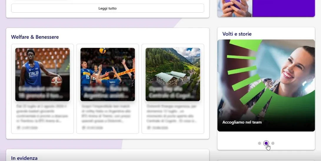
From that work came the new visual identity, with a palette replacing the blues with a deep violet, called Indigo internally, and a lime green used to animate the navigation menu on hover. It was a work of meticulous care on every graphic element, from textures to custom imagery, right through to the homepage layout and the names chosen for each section.
The naming work was particularly significant, because every label had to reflect the group identity the company wanted to convey. The individual entity mini-intranets were switched off, and all content useful to everyone was consolidated into a single platform.
The people directory was given greater prominence on the homepage, because colleagues had identified contact search as a priority need, and alongside it HR initiatives, employee benefits, and local sponsorships were given more visibility too, from community sports teams to Christmas markets, in keeping with the fact that the company operates in the energy sector within a territory it has close ties to.
To manage the high turnover without flooding users with repetitive announcements, a kind of collective newsletter was introduced, gathering both farewell messages for retirees and welcome notes for new joiners in a single news post. It consistently ranks among the most-read content on the whole intranet. New joiners are asked to fill in a short form with a photo and a brief description of themselves, a small gesture that makes the welcome warmer and invites people to share a piece of themselves from day one.
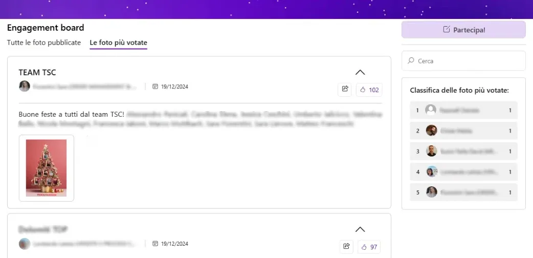
The two Christmas campaigns run over recent years illustrate how the tone of this communication has evolved. The first edition invited teams to share a photo representing their Christmas, with a playful and open approach, accompanied by a fictional character created for the occasion who told a small story each day, from Christmas cards to the lighting of the company’s Christmas tree, sponsored with renewable energy.
The second edition instead asked employees to represent one of the company’s newly launched values. To address legal sensitivities around sharing employee images, a mandatory disclaimer with explicit acceptance was introduced before participation was enabled. The final prize was designed together with the client’s team: the winning photo was turned into a jigsaw puzzle, delivered to the department that took it, which then assembled it together and hung it in the office, turning the online initiative into a small offline team moment too.
Christmas campaign on the company intranet
The Results: more traffic, stronger community, more trust
The numbers tell a story of solid participation across both editions.
The first campaign gathered 290 likes, the second, more corporate one, 238, but the campaign page attracted 706 unique visitors, a figure that goes beyond direct interaction and shows how many people paused to look even without engaging.
Overall intranet traffic rose during campaign periods, partly due to a dedicated homepage button that caught the attention of users who might otherwise not have read the news.
The most significant result, however, was building trust with a stakeholder who initially approached initiatives like this with caution. Every proposal required concrete examples, data from similar projects, and a clear rationale before receiving approval. Over time, even the more conservative voices within the client’s team began to open up, and today new requests arrive with considerably greater mutual confidence.
Company intranet rebranding
What’s Next?
The first priority is a full navigation menu review, which over the years has accumulated many sections and needs restructuring to remain intuitive.
The second is creating a proper onboarding area, designed to guide new hires through a structured journey, modelled on other projects already delivered for clients with similar needs. Given the volume of people joining each year, this will require direct involvement from the HR team, and the goal shared with the client is to complete it within the current year.
Data analysis work is also expanding. A more comprehensive report is being built, covering views on HR-related pages, work that will still take a few months but will provide a much clearer picture of how people actually use the platform day to day.
Changing the colours of an intranet is only the visible surface of deeper work: reclaiming a common voice when previously each entity had been speaking its own separate language.
Do you want to renew your intranet’s identity and unify your company’s communication? Book a demo and discover how intranet.ai can guide you through the restyling of your platform.