SharePoint Web Parts:
the top 5 for your intranet
Have you ever wondered how to build a dynamic,
easy-to-navigate site?
If yes, know that the answer is not "with SharePoint."
The answer is "with its web parts."
Find here what they are, what they are for, and our selection
for your intranet.

SharePoint Web Parts:
What they are and what they are for
SharePoint is Microsoft 365's platform for building dynamic and intuitive sites.
Dynamic, because they host a diverse range of content that can change frequently to showcase
the latest updates and most important information.
Intuitive, because their flexible design allows them to build simple and clear navigation for users.
These features have caused SharePoint to be and continue to be chosen by many companies to build their sites. In particular, the intranet.
The intranet is the center of an organization's communication and activities, whatever its field or size.
Within it, it is possible to:
- store, share, and cooperate on project files and documents;
- write and publish newsletters that are engaging and targeted to specific audiences;
- promote career opportunities and services to employees;
- find, get to know and contact their colleagues;
- start discussions and circulate questionnaires to engage the business community.
And the list goes on and on.
All this is made possible, of course, by the features and components that operate behind the scenes of the platform, enabling millions of users with no knowledge of web design and programming to create practical and aesthetically pleasing sites.
Among the main components, the so-called "web parts" stand out.
Let's find out together what they are.
What is intranet.ai?
intranet.ai is the ready-to-use corporate intranet, designed to reduce costs and implementation times, thus creating a collaborative and modern digital work environment:
- Initial price of 3,650 €/year for a complete intranet
- 80+ applications, including advanced search, document management system, push notifications via Teams, personal profile, and FAQ pages
- 100% integrated with SharePoint Online and Microsoft 365

Web parts are the sections that make up the pages of a SharePoint site.
Inside them, you can insert features that users will need to consume content or use services and tools useful for their work.
From showcases in which to display the latest news to integration with external apps, SharePoint's web parts are what make it possible to create a centralized and cue digital work environment.
But to reach this ambitious goal, you need to know what content and functionality a good SharePoint site should have to be considered one.
If you have no idea where to start, don't worry.
In this article, we bring you a ranking of the web parts that years of experience have taught us are the most loved and used.
Before we delve into the details of each of them, we want to answer a frequently asked question, namely, what should be done to insert a web part into a SharePoint page.
Find the answer in the following chapter.
How to add a web part to a SharePoint page
It is very simple.
To insert a new web part into one of your SharePoint pages:
- Click on "Edit" at the top of the page you are interested in.
- Scroll your mouse pointer to the part of the page where you would like to add a web part.
- Click on the "+" symbol that will appear in the section you are pointing to.
- Select a web part from those proposed in the drop-down menu.
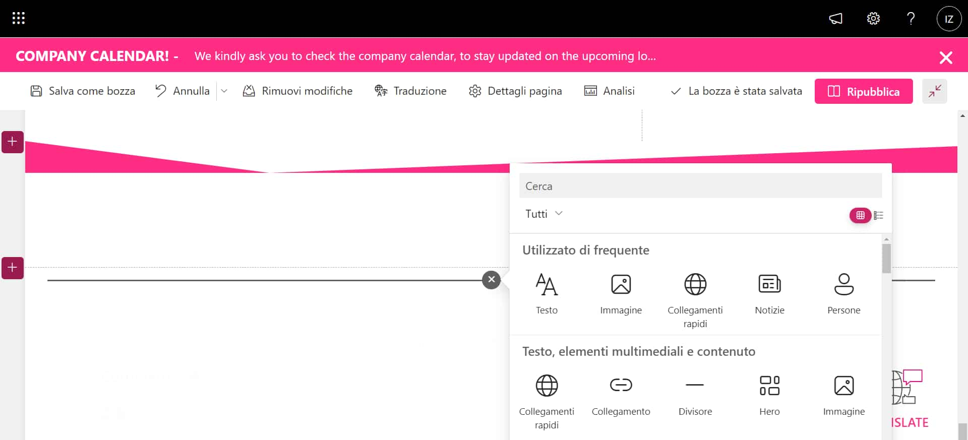
Adding a web part
Now, you can customize your web part.
For example, the "News" web part can be modified to present the most relevant content for specific categories of users.
By manipulating its filters, you can turn it into a showcase dedicated to HR communications, rather than directives from the global.
To explore this topic further, check out our article on
how to create a blog with SharePoint.
As we reach this point, we have one last note to make.
Indeed, remember that SharePoint has +40 different web parts.
Consequently, we encourage you to explore the platform after reading this article to discover all the opportunities it offers you to enrich your sites.
The 5 web parts that can't be missing
in your intranet
Here we come to the heart of the issue.
Mark the 5 web parts you find in this list somewhere, or even better, put them on your pages as you continue reading.
The goal is to give your people the best tools to do their jobs.
The side benefit is to make sense of your investments in digital innovation.
After due introduction, we can begin.
1) News Web Part
The "News" web part is the first one we are asked to insert and format by our clients. Why?
For two main reasons:
- It allows users to know the latest updates from their company, as well as communications relevant to their role and activities.
- They make a site's pages more attractive.
Let's look at these points in detail.
News Web Parts can be customized to show news posts from the hub site, a vertical site, a site outside SharePoint, or sources of interest to the user*.
*Recommended sources include posts published by people close to the user in the organizational chart, by members of their teams, and by sites they frequently follow or visit.
To choose your news source, you need to click on "Edit" at the top left of the web part and select one of the options under the heading "News Source" - you understand now why the platform is called intuitive, right? -.
However, you can set filters in your News Web Parts to show posts published on a site, but only if they are tagged.
If you do not know what tags are, we will briefly explain them.
Tags are the metadata that are used in SharePoint lists to categorize their contents.
Like all SharePoint lists, those that accommodate your sites' news pages are made up of columns. Here, metadata is entered.
For example, you might have the column "Author," "Last Modified," "Date Created," and "News Category."
In each, you will need to enter the correct tag so that your posts can be filtered by web parts.
In our experience, the news categories that are never lacking in an intranet are as follows:
- Corporate, for news from global management.
- Highlight, for news to be highlighted and that is generally related to a particular event or initiative.
- HR, for news created by Human Resources.
Of course, each company handles communications in its way, perhaps including topics not strictly related to the core business, but of strong interest to users.
In this regard, we have noticed that "Wellness in the company" and "Sustainability" themes have been enjoying considerable success lately.
Keep them in mind: they could prove to be great ideas for new newsletters to offer to your audience.
Another important aspect to note is the possibility of targeting news by target groups.
To do this, you will still have to get your hands on the list that collects news on the site.
You will have to enable assignment to target groups from the list settings, and then you will have to add the column where you indicate the target group for each of your news items.
For example, you could enter the column entitled "Audience" and indicate for each post the user group to which it is addressed.
To complete the procedure, you will need to click on "Edit" in your web part and enable the flag for assignment to target groups.
Once done, you will get news showcases capable of adapting to the needs and interests of your corporate audience.
Now, all left to do is to talk about the presentation.
Indeed, graphic presentation is crucial to capture users' attention and entice them to read your news.
For this, SharePoint provides a curated selection of layouts.
We list our favorites below:
- Carousel.
The web part shows one news item at a time, foregrounding the title and cover image.
The visual effect is nice, especially when the cover images can stand out from the content of individual posts.
To scroll through the news, there is a choice of automatic or manual mode.
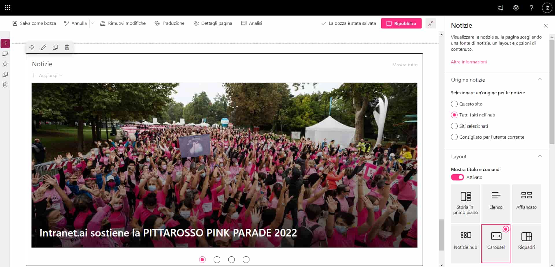
Carousel news layout
- Boxes.
News items are presented as pieces of a mosaic.
The tiles thus allow for colorful and uncluttered showcases.
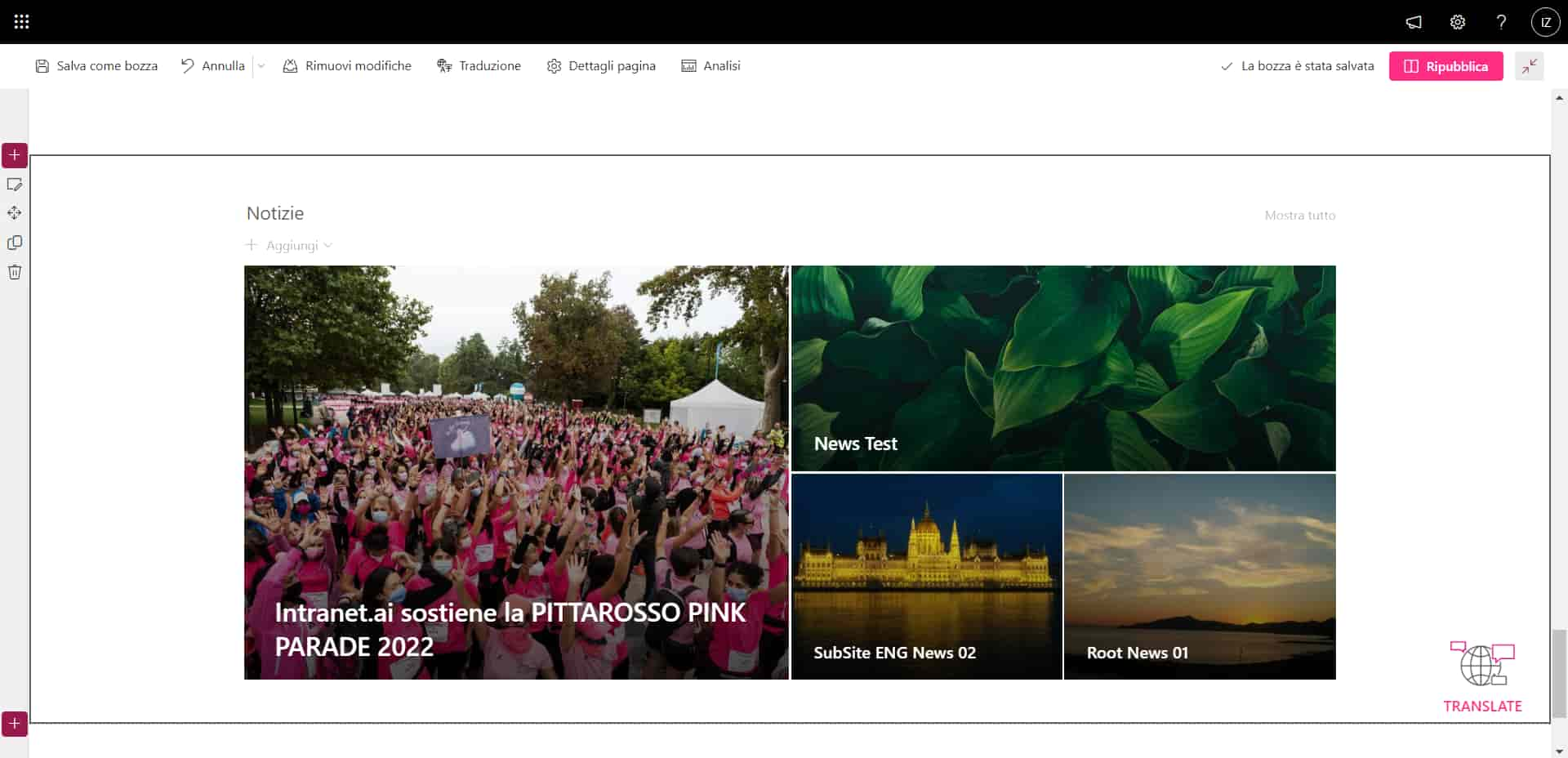
News box layout
- List.
A simple, uncluttered layout where information takes priority over graphics.
Lists are often used to accompany more aesthetically appealing storefronts, enriching pages without weighing down the user experience.
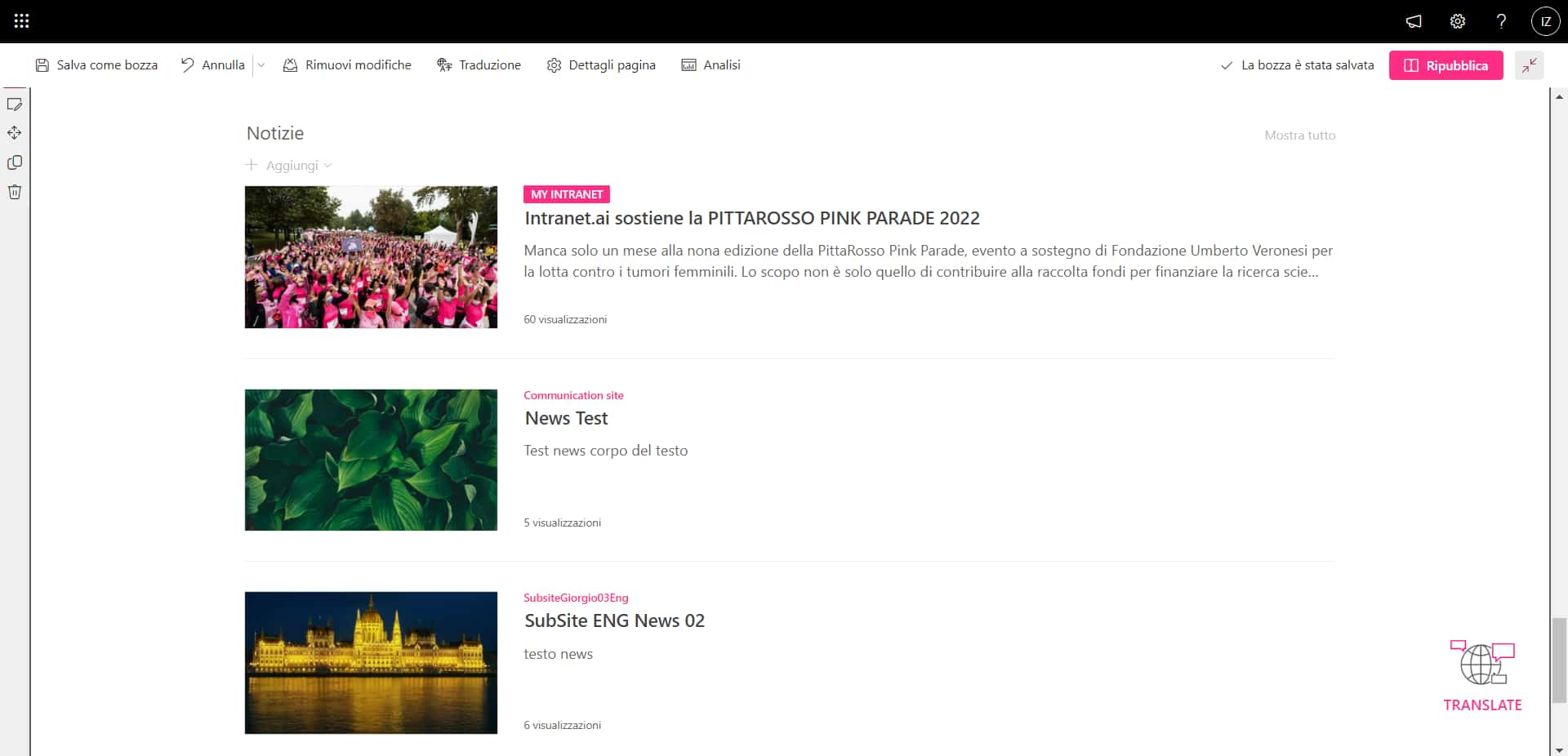
Listed news layout
- Featured Story.
Web parts with this layout are divided into two parts: on the left, the main news story, highlighted by cover size; on the right, a concise list of three or four posts, related or not.
The perfect balance between the sobriety of the lists and the colors of the boxes.
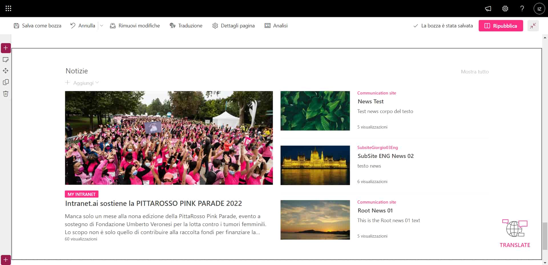
"Featured Story" news layout
And now, have fun with it.
Find the style that best reflects your company's identity by combining the content and design of the "News" web parts.
2) Calendar
It is never missing on any desk.
Let alone in the intranet.
That is why the second position of our Top 5 is dedicated to it.
Whether it is paper or not, this object remains the inseparable companion of our days, reminding us what commitments we have made, with ourselves or others, when it will be X day of that event we would like to attend or how much time is left until the next vacation.
All this you can find in the "Calendar" web part.
But with some more functionality, and going beyond simple personal organization.
In fact, the SharePoint calendar is designed to coordinate the activities of teams.
The how is simple: users with access to a SharePoint site receive a notification in the linked Teams group for each marked activity.
As a result, it will be impossible to miss important events such as:
- meetings;
- deadlines;
- transfers;
- closings;
Each appointment will remain recorded in the shared calendar and can be changed by users according to their personal needs, without going through an endless series of incoming and outgoing emails.
If you try it, you will never be able to do without it again.
As for customization, this web part does not have the same colorful designs as its news counterpart.
However, it has enough flexibility to be added to any page without sacrificing convenience.
Specifically, it comes in either "exploded" or reduced mode.
The former allows you to display the days of a month as if they were those of a regular desk calendar; the latter, on the other hand, shows them following a real timeline.
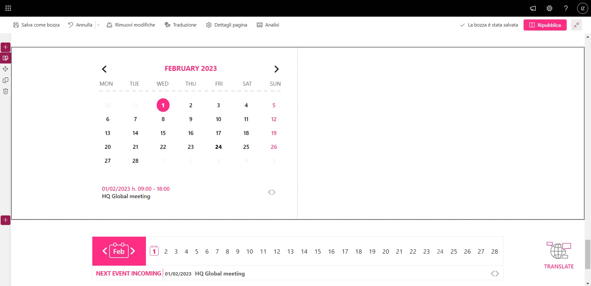
Exploded and reduced view of the Calendar
No matter what you give this web part looks like.
Your users will love it.
3) Company Apps
Third place on the podium is taken by Company Apps, the web part that brings together the tools and work materials recommended by the company to its people.
Within it, users enabled by management can add links to:
- SharePoint sites;
- external sites;
- custom apps;
- Microsoft 365 apps;
- third-party apps;
- files, documents and presentations;
- multimedia content;
To make the use of this web part easier for users, you can create categories and divide links based on the same project, department, location or company.
Although Company Apps was developed by our team as an add-on for SharePoint, you can create a similar section using the "Quick Links" web part.
Once admins have entered resources to recommend, they can modify the layout of this web part to make their collections of links more recognizable and pleasing to the eye.
As always, you have several graphics available.
Our favorite is the grid, because it allows you to customize each link with a small cover image.
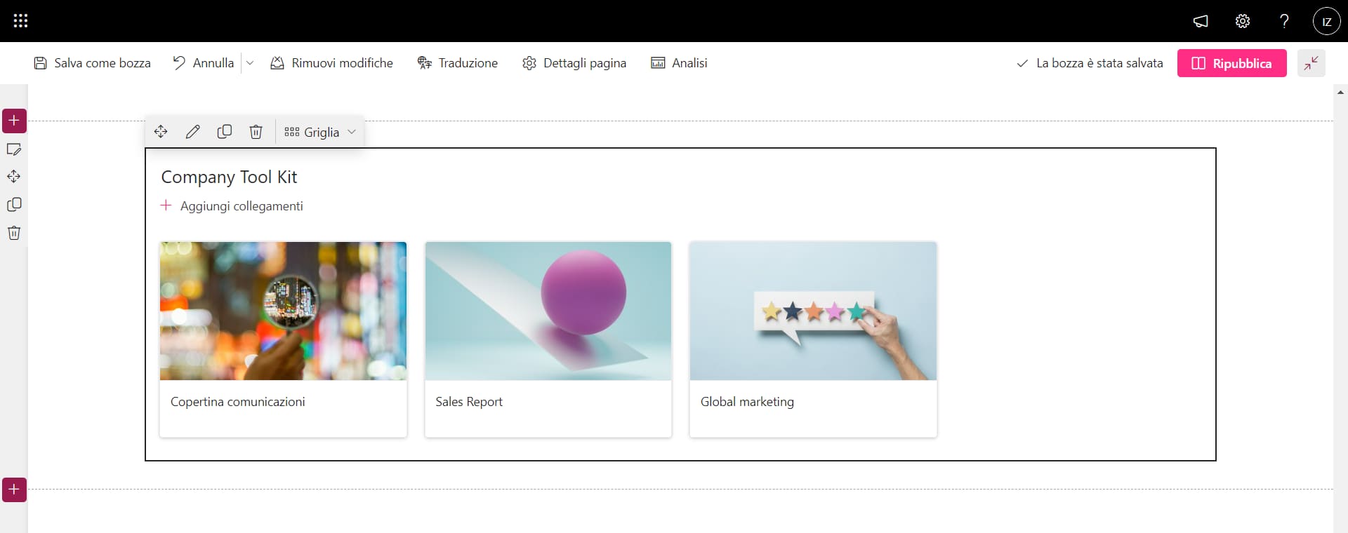
Layout of the "Quick Links" grid web part
But if you prefer minimalist layouts, the list layout always remains.
What matters is to show your users that the intranet can help them in their daily activities.
4) Forms Web Part
Coming in fourth place is the Microsoft Forms web part.
If you are not familiar with it, Forms is Microsoft 365's app for creating customized questionnaires and forms.
Its goal is to improve communication between people, especially when it comes to making important business decisions together.
The Forms web part then allows you to import the forms built into the app into one of your pages.
These could be initiative-specific questionnaires or questions to be left permanently on the site.
An example of the latter might be the section dedicated to collecting feedback, suggestions and criticism, to give users a space in which they can always make their voices heard.
However, this web part has a major weakness.
Once they are placed on SharePoint, the forms get rid of your graphic customizations to appear as simple text content.
The advice we give you in order not to lose the communicative power of your brand colors and shapes is to act on the page where you have inserted the web part.
Add images and multimedia content that can accompany your questions and make clear the theme to which they tie in.
As a final point to make, we want to automate.
You may not be aware of it, but Microsoft's tools are designed to expand their capabilities by integrating them with other products.
Forms is no exception, and one of the most popular integrations is the one that features Power Automate as a co-leader.
With Power Automate, it is indeed possible to build automated flows to simplify people's work.
If we take the case of Forms questionnaires, automations are often used to send notifications whenever a response is delivered or to store data collected from forms in special SharePoint lists.
And of course, yes: linked flows remain operational even when the questionnaire is imported into the web part.
Useful, isn't it?
To learn more, see our article on the
most frequently used workflows for SharePoint Online.
All that remains is for us to tell you to use this web part to increase the engagement of your users.
The results will not take too long to show.
5) My Workplace
In an environment where community is at the center, this is the web part for the individual.
My Workplace brings together work groups and the individual user's profile, helping them to:
- Improve coordination and communication with preferred teams.
- Keep personal information at hand.
On the one hand, then, My Workplace helps people keep their profiles up-to-date, which is the container of information that is indexed in the intranet's people directory.
Consequently, if you want to be found by your colleagues based on your role, department and skills, it is important to take care of this section in detail and frequently.
On the other hand, users can use My Workplace to manage their projects directly from the intranet, either by accessing groups already on Microsoft Teams or by creating new ones.
In the latter case, there is the possibility of creating project groups based not only on Teams features, but also on Planner and OneNote features.
If you are not familiar with them, you should know that Planner is a Microsoft 365 tool specifically created for project management activities.
It is based on a "bulletin board" structure where you can enter the tasks and subtasks that you and your team need to accomplish.
Add to that the OneNote features for sharing and collecting the most relevant notes and materials for ongoing projects and initiatives, and the picture becomes complete.
Lo and behold, My Workplace allows you to create groups that automatically integrate these three tools, making collaboration effective right off the bat.
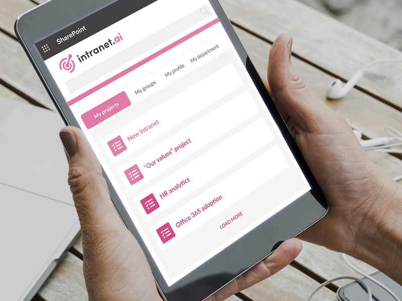
My Workplace detail
We decided to put this web part in our ranking for an additional reason: Its ability to adapt to an individual's preferences without outside intrusion.
As you may know, SharePoint has a multi-level permission system to determine in detail what individual users can and cannot do on its sites.
The highest level allowed is "Full Control," and users who have it have the ability to manage any of the underlying operations of a site, including customizing the components, content, and features that are available to other users.
My Workplace is the exception.
Admins are not allowed to modify this web part.
They can only view its contents, to understand how it is used by the intranet audience.
Having reached this point, there remains one last, important aspect to talk about.
Indeed, we must emphasize that this web part was developed by our team of developers at the request of the companies that chose us to build their digital work environment.
Although SharePoint has countless features that are practical and easy to use, it still does not have an area dedicated exclusively to the preferences of the individual users who populate its sites.
Therefore, we created My Workplace, to go beyond the standards of the platform.
But why are we telling you this?
The reason is that our web part, by its very nature, is not available among the basic components of SharePoint.
However, we wanted to introduce it to you both because the creations of our developers always deserve some attention in our articles and because it is only fair that you know that you do not have to limit your intranet to the mechanisms of the platform on which it is built.
You can expand it.
And we can help you.
Default isn't enough for you?
We have +25 web parts to go beyond the boundaries of SharePoint:
- Automated, search-indexed document repositories.
- Customizable graphics to communicate your brand in every detail.
- Interactive mapping of corporate locations.
- Ticketing system integrated with Microsoft Teams.
We've listened to our customers to build the intranet that's right for them.
We're ready to listen to you, too.
Giuseppe Marchi
Microsoft MVP for SharePoint and Microsoft 365 since 2010.
Giuseppe is the founder of intranet.ai and one of the leading experts in Italy in all matters related to Microsoft 365. For years, he has been assisting companies in creating their digital workplace environment on the Microsoft cloud, focusing on people's experience.

Keep on reading
Microsoft Forms: Guide in 6 Steps to Create Your Surveys

Learn how to create smart surveys and online questionnaires with Microsoft Forms. Discover features, integrations, and easy steps to collect responses.
SharePoint Consulting: Why Choose intranet.ai?

Let's see who SharePoint Online consultants are and what they do, why it is beneficial to rely on their services and how to choose the right experts.
How to delete a SharePoint site in 5 moves

Steps to follow and alternative solutions: That's what you'll find in our mini-guide to deleting SharePoint sites.
