SharePoint layout: here's how to customize your intranet!
Where do you start to customize an intranet's layout and content? Why use SharePoint Online?
In this article, you will find the answer to these and many other questions.
Enjoy your reading!

What you will find in this article
SharePoint Online: why it is the best tool for your intranet
Born in 2003, SharePoint has revolutionized the way people work because of its ability to create digital spaces where a plethora of content and business services can be designed, shared and utilized.
Today, this goal might seem rather trivial and not particularly relevant when choosing a site creation tool, given the growing number of alternatives on the market.
To understand the real value of this tool, therefore, we must set the record straight about how SharePoint creates modern work environments.
From its origins, the platform was designed to be a bridge to a digital work environment that is not only practical, but also intuitive, dynamic, and engaging.
The goal was and remains to provide a corporate portal in which employees:
- find information quickly;
- are stimulated to read the latest news;
- interact in real time;
- conveniently use tools to fill out documents, share files, make requests, and many other procedures.
All this, regardless of location or work device, and with a focus on the user experience.
But what enables SharePoint to achieve this goal?
The answer is divided into 3 properties:
- Strong customization of layouts and content without code writing.
- Deep integration with Microsoft 365, Microsoft Viva and Power Platform apps.
- Centralized management of governance components such as sharing permissions.
A company can thus minimize the time and cost of setting up a site and maintaining technical control resources while gaining greater engagement with its audience.
In fact, the high level of customization applies not only to site architecture but also, and more importantly, to the targeting of communications based on labels and user data entered into the system.
In addition, SharePoint can rely on Power Automate to eliminate all the repetitive manual tasks that burden an organization's processes.
The result?
Better interaction and productivity in business teams. Without wasted time and stress.
Needless to say, this result is not so easily achieved with any tool.
In this regard, we take the opportunity to dispel a myth: replacing SharePoint with Microsoft Viva.
We are often asked if it is possible to create a corporate communications site with Microsoft Viva rather than good old SharePoint.
No. It is not possible. Why?
Because although Viva has Viva Connections as a collaboration module, this tool was not designed to lay the foundation for an intranet.
In fact, Viva has a complementary function to that of SharePoint, since it allows the latter to integrate the corporate portal into Teams.
After this brief introduction, we can get to the heart of the matter and see what an intranet for Microsoft SharePoint is and how to build it from scratch.
What is intranet.ai?
intranet.ai is the ready-to-use corporate intranet, designed to reduce costs and implementation times, thus creating a collaborative and modern digital work environment:
- Initial price of 3,650 €/year for a complete intranet
- 80+ applications, including advanced search, document management system, push notifications via Teams, personal profile, and FAQ pages
- 100% integrated with SharePoint Online and Microsoft 365

Team site and communication site with SharePoint: what is the difference?
SharePoint allows you to create two types of corporate sites.
Let's clarify the difference between them.
Knowing this difference is important in order to understand both the potential of the tool and the purpose and characteristics that an intranet must have.
So starting with the first type, a team site is a private collaboration area where members of a project come together.
Here, users can store and edit files as well as create and manage lists of information.
Interestingly, each team site corresponds to a Microsoft 365 group, which provides access to:
- an instance of Planner for managing the group's activities;
- an instance of OneNote for saving meeting notes or information that does not find a place in a project document;
- Teams, which needs no introduction.
As for the second type, a communications site represents the corporate portal for all employees, in which news, reports, services and documents are shared.
In other words, this space is the intranet.
Thus, a communication site speaks to a broad audience and seeks to engage them in corporate communications, while a team site primarily targets an inner circle of people working on the same project.
As a result, the user experience will be radically different within these two environments.
This translates into a diversity not only of content, but also of layout and functionality: for a team, SharePoint prefers a minimalist and spartan interface, while it transforms into a showcase of eye-catching images and graphics when it has to interact with the varied audience of the intranet.
Before creating the latter, it is therefore necessary to understand that design and communication style play a leading role in ensuring the effectiveness of the platform and its adoption by the corporate audience.
Keeping this idea in mind, let us now see how to go about creating an intranet with SharePoint step by step.
Structuring the layout of the SharePoint intranet
Let's start from the Microsoft 365 home page and enter SharePoint.
Its home page collects all the sites we have created or are part of.
From here, the first thing to do is to choose the type of site by clicking on "Create Site" (top left).
As we saw in the previous chapter, there are two options: team site and communication site.
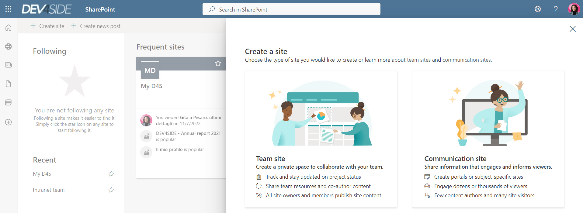
Since the purpose is to create an intranet, the right choice is communication site.
Name and default language will be the first attributes that allow SharePoint to distinguish the new portal from those already on your home page.
A little tip for this first step: Pay attention to the default language.
Once selected, in fact, you will not be able to change it (unless you decide to tear down and rebuild your intranet from scratch).
However, the platform will allow you to configure content and navigation in different languages.
This will ensure that the corporate portal can still become a space capable of bringing together an international audience.
Once the communication site is created, you will enter a template that you can edit in:
- Header.
Here, you have the logo and title of your site, as well as the global navigation menu.
- Menu with action buttons, present below the header.
Generally, these buttons are available to the site administrator or administrator, while they can be hidden from the user in whole or in part.
- Content structure.
Each page of the site can be divided into sections (the web parts) that will house content.
Among the various possibilities, you can decide which type of web part to use, where to arrange it, and whether or not to take advantage of ready-made design templates.
- Application bar, present to the left of the contents.
From here, the user can reach the home page of the intranet or view items such as:
-
- the list of sites to which he or she belongs;
- personal news items, coming from all personal sites and sorted by importance and date of publication;
- personal files, from SharePoint, Teams and OneDrive;
- personal directories, which contain the user's information records (e.g., lists of contacts, requests, etc.);
- the "Create" function, which allows users to quickly write content to add to OneDrive or personal lists.
Here, then, are the components on which to base the layout of your intranet.
The advice is to modify them with the user experience always in mind, and in this regard, we repeat that a modern communications site must be:
- Intuitive = easy to use right from the first time.
- Dynamic = able to interact with the user by diversifying form and substance (e.g., adapting content to individual language and preferences).
- Appealing = pleasing to the eye.
At this point, a question we are often asked is whether and how the intranet can be customized so that it reflects the characteristics of the corporate brand.
To answer it, let's move on to the next step.
Enhancing the corporate brand in the intranet
One of the most cherished topics for any organization (as well as individual practitioners) relates to effectively communicate its identity to the public.
This communication strategy is embraced by the term branding, which is the construction of differentiating elements such as logo, name, color palette and tone of voice, which should be present at all points of contact between the company and the public.
Of the latter, employees are also included.
The intranet is thus a communication space that a company can (and should) leverage to cultivate an organic culture and identity among its people.
And this is where SharePoint's customization possibilities come into play.
Starting in settings (thumbwheel icon in the upper right corner), you will see "Change the look".
Click here.

This section will in fact allow you to change:
- Graphic Theme.
Beyond the many templates offered by the platform, you can create and apply your own corporate palette template.
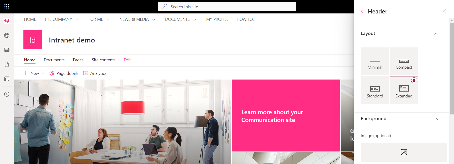
- Header.
You can choose between minimal, compact, standard or extended display. Test it out and see which one appeals to you the most.
For us, the extended option is particularly interesting because it allows you to include a cover image and company logo.
- Navigation menu.
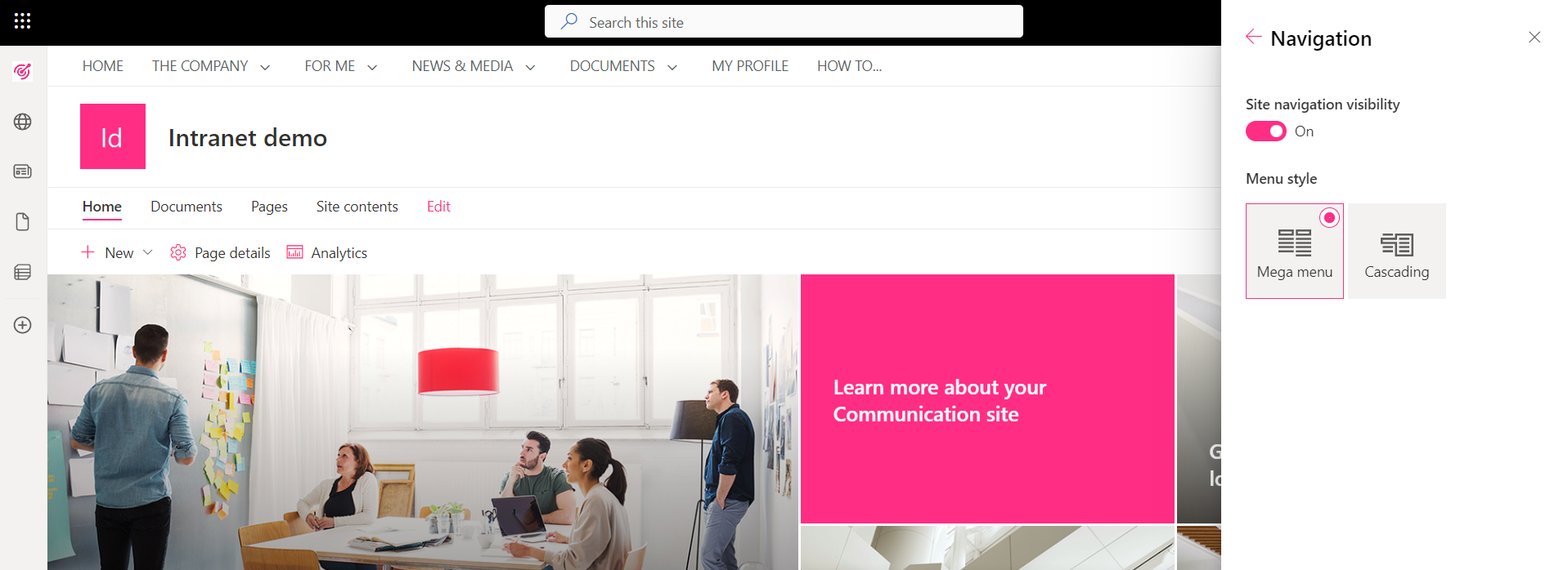
We start with two options: show the menu or hide the menu from the user.
If you choose the former, you get two more options in return: mega-menu or cascading menu. Again, let your taste convince you both functionally and aesthetically.
- Footer.
As with the navigation menu, you can choose whether or not to show the footer.
If you opt to show it, you can choose between extended layout (with links on multiple lines) or reduced layout. In addition, you have the option to insert logo and intranet name and apply the corporate palette.
Customizing these elements is enough to quickly create a branded effect of the site.
However, you may have already noticed that the list is missing a key aspect of effective communication.
That's right. Content, what happened to it?
We mentioned earlier that pages on SharePoint sites can hold a plethora of information in specific sections, called web parts.
The first thing you can do in this regard is to decide how many sections, between rows and columns, to divide the page into.
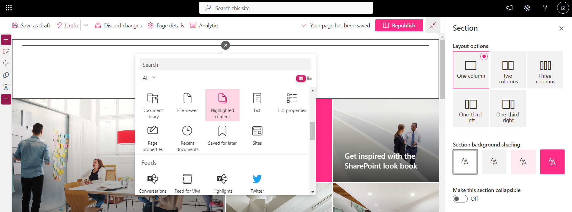
After that, you can place the content you want in each section. Just click on the section you want to edit and trivially select "Edit".
At this point, the platform will offer you a list of items such as:
- Text box.
- Media content.
- Documents.
- Quick link lists.
- Social accounts such as Twitter.
- Weather.
- References to people.
- News.
- Etc.
We want to emphasize that you can accompany this content with tailor-made graphics.
For example, a list of quick shortcuts can be presented as a simple list of links or as a series of icon boxes.
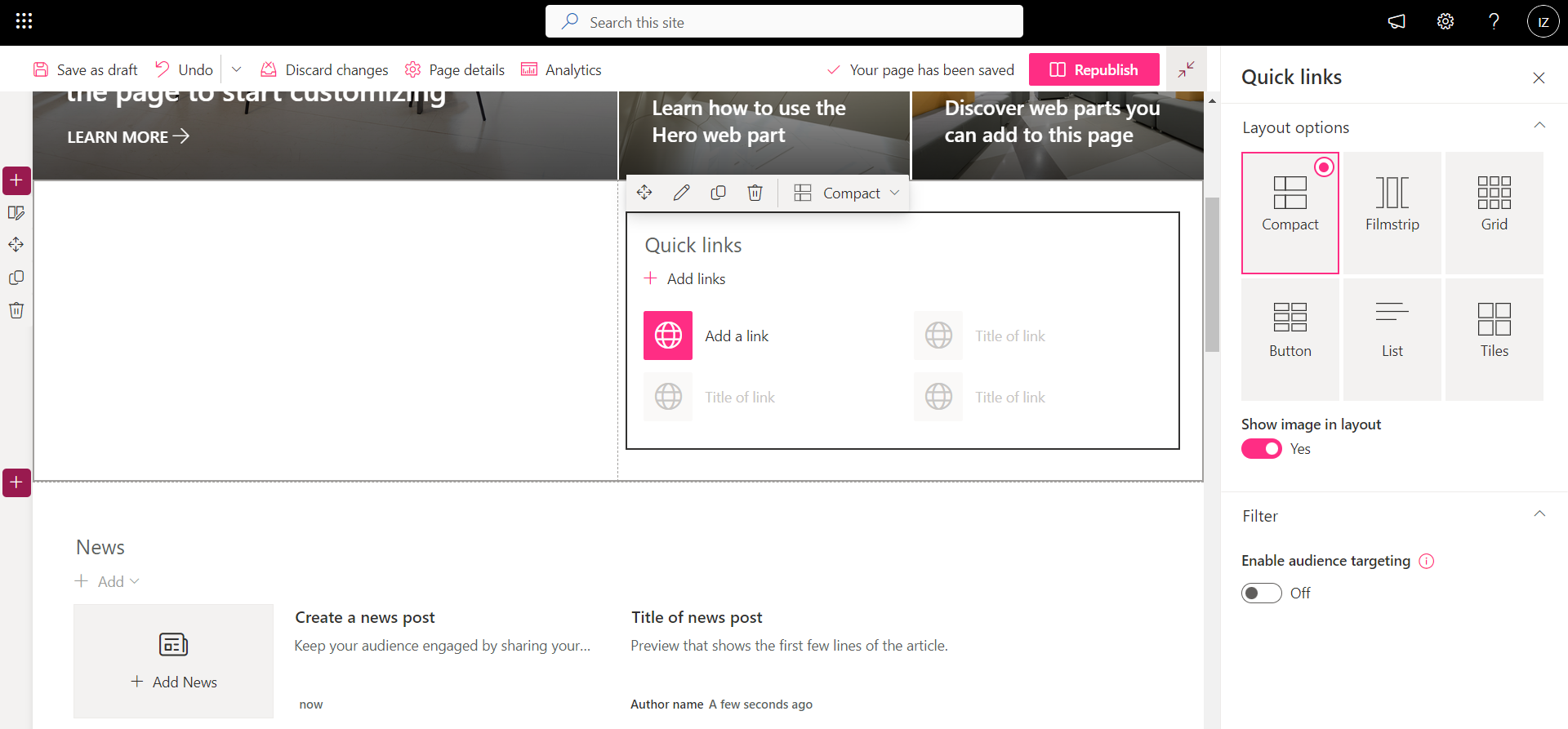
Finally, you can upload web parts developed by third parties to deliver content tailored to your employees.
This will allow you to achieve a greater level of customization, the only weakness of which is Microsoft's updates.
In fact, non-native SharePoint web parts may fail after a system upgrade.
But don't worry: a developer's intervention is all you'll need to readjust them.
Remember that the intranet is a work-in-progress
We have therefore come to the end.
We have seen how to design an intranet to meet the needs of the company, which wants to communicate effectively with its people, and the user, who needs to navigate fluidly between news, documents and services.
But this journey does not really end with today's article.
If anything, the latter represents your starting point.
A good jumping-off point that will have to be tested and reshaped over time, because it will have to adapt to the needs and goals of the moment.
Our advice: keep yourself curious, empathic and open to audience feedback.
Involve them in communications and make them active participants in the growth of the company site.
The results will not delay coming.
Giuseppe Marchi
Microsoft MVP for SharePoint and Microsoft 365 since 2010.
Giuseppe is the founder of intranet.ai and one of the leading experts in Italy in all matters related to Microsoft 365. For years, he has been assisting companies in creating their digital workplace environment on the Microsoft cloud, focusing on people's experience.

Keep on reading
Storytelling aziendale: come scrivere articoli che la intranet vorrà leggere

Want to write engaging articles for the intranet? Learn the art of storytelling.
SharePoint corporate newsletter: How to write it in 9 steps

9 steps, one tool: Ready to create your latest corporate news with SharePoint?
Microsoft Teams app: What it is and how to use it

Let's have a look at the most important features and integrations of Microsoft Teams, the queen app of digital collaboration.
